A new AMC with four funds, zero brand recognition, and two completely different users arriving at the same page. Three weeks to design a discovery experience that worked for both.
The site was organised around how funds are classified, not around why someone would invest in one. SEBI's standard categories assume financial literacy the average retail investor does not have.
With 4 funds at launch, category-based browsing would surface 1 to 2 results per section. A dead end that undermines trust before it is even built. The website had the right answers. It was asking users the wrong questions.
"Limited knowledge about fund types and time-consuming research"
Most cited barrier · User interviews across all demographicsQualitative interviews with 6 to 7 users (informed by a broader survey of ~150 respondents across Tier 1, 2, and 3 cities) revealed a clean split in how people approached fund selection.
Most AMCs solve for one type and hope the other figures it out. The opportunity was designing for both without the experience feeling cluttered to either.
Analysis across Groww, Coin, Angle One, smallcase, and international AMCs surfaced a consistent gap. Every platform solved for one user type. None balanced both well.
The architecture could not route either user type through the other's experience. Both paths had to exist on the same surface.
Two structural approaches were on the table. The call required weighing clean IA against conversion risk.
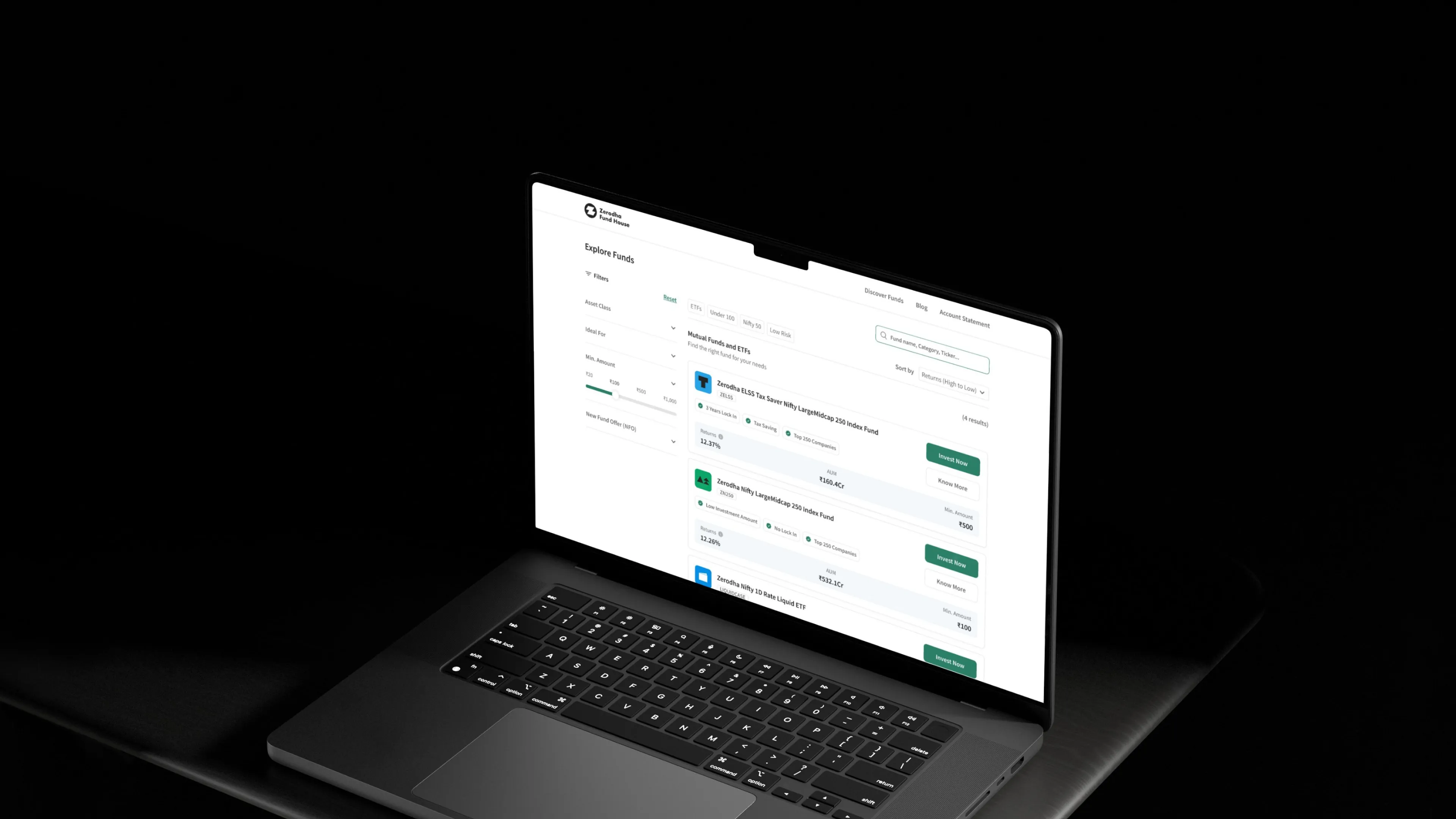
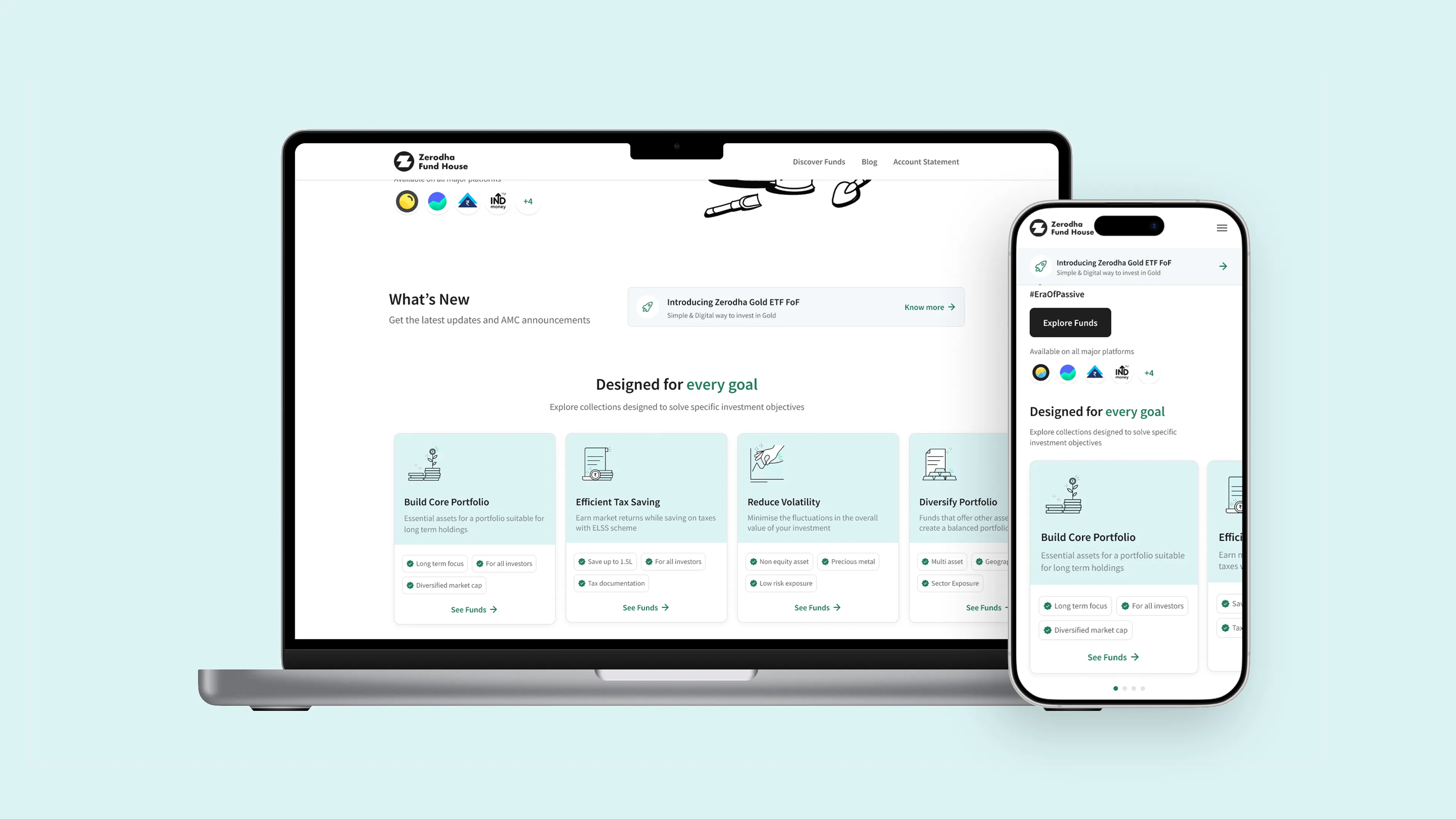
The page leads with Investment Goals: curated, relatable, low-friction. Below it, the full fund listing with search, filters, and sorting. Two entry points. One page. Each user self-selects their path.
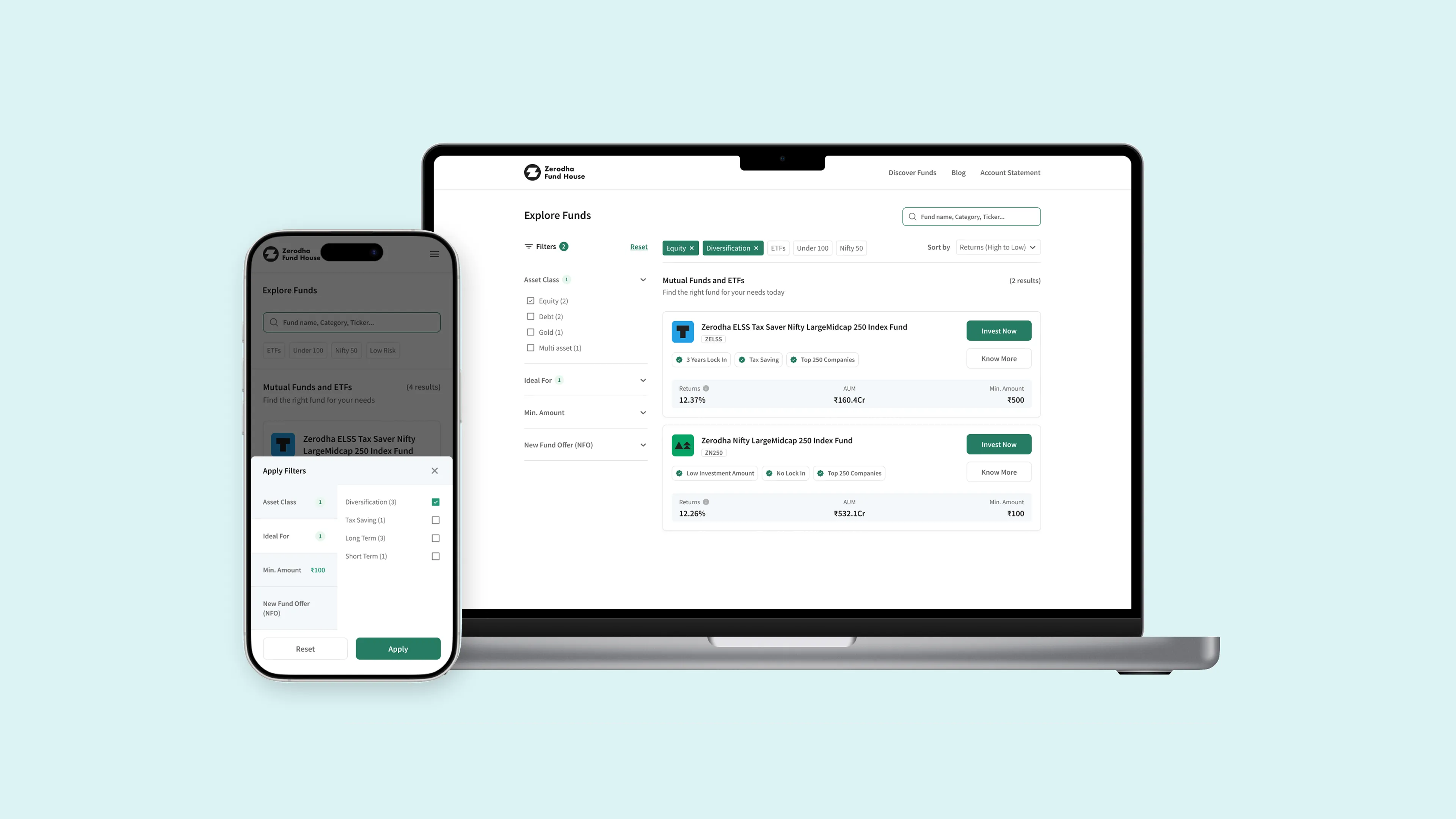
Collections framed around user intent: "Build Core Portfolio," "Tax Saving," "Long Term Investing," "Liquidity." Each maps to 1 to 2 funds today. The structure absorbs new products without restructuring the page.
Every label was chosen to meet the user where they are. "Tax Saving" over "ELSS." "Build Core Portfolio" over "Large and Midcap Index Fund." The naming was the design.
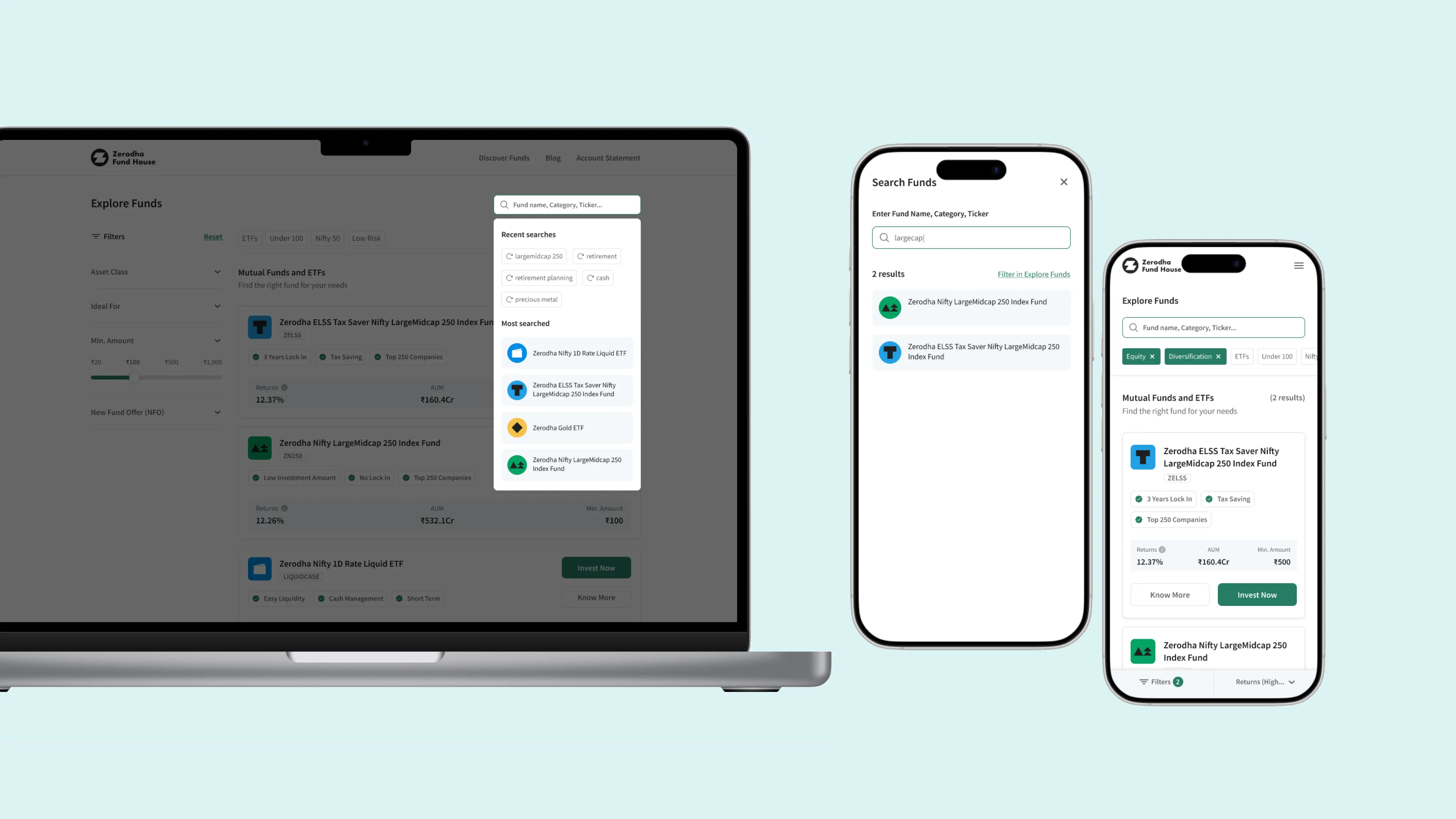
Smart search supporting fund names, tickers, and categories, with recent searches and most-searched options as quick-access tags. Scoped to the listing page at launch; global search noted as a future expansion.
One detail that mattered: fund count shown per filter option. Competitor research showed hidden result counts caused users to click into categories and immediately leave when they found 1 result. "Index Fund (2)" sets expectations upfront.
Each scheme page was already fully built. The card had to decide: how much of that belongs here? The answer required thinking about who is looking at a fund card and what they need to do next.